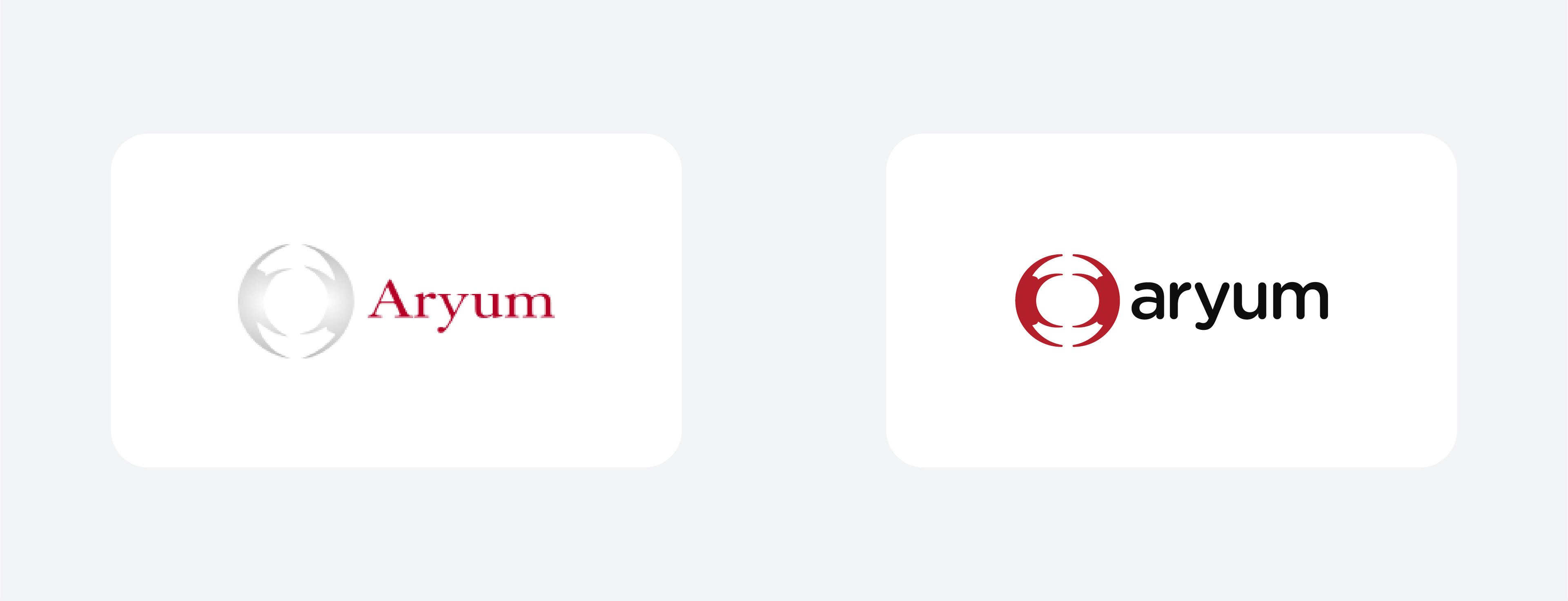
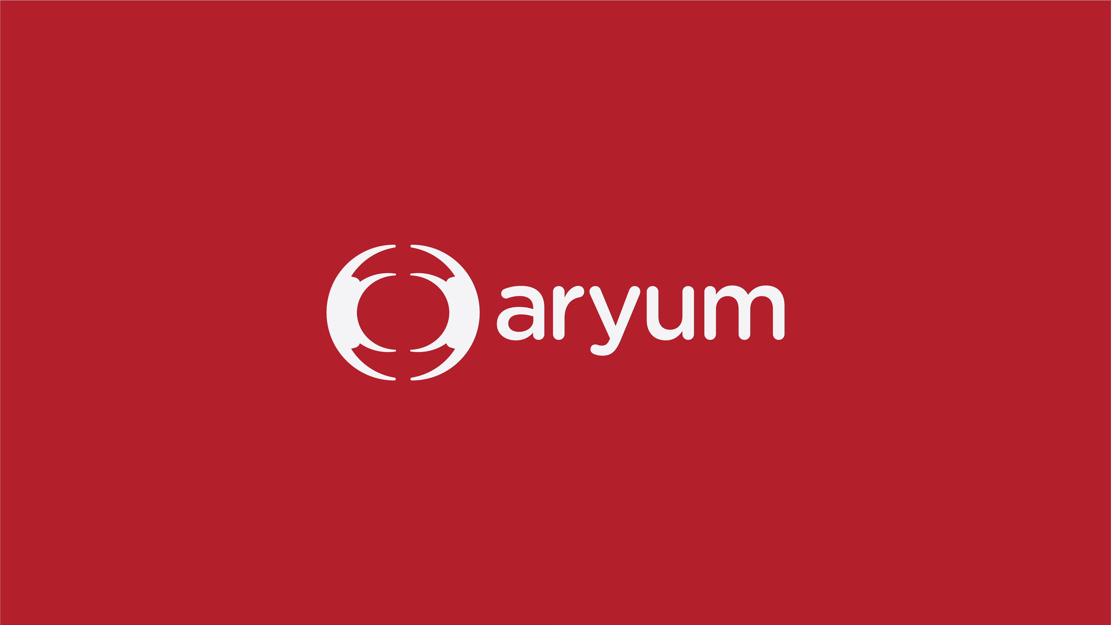
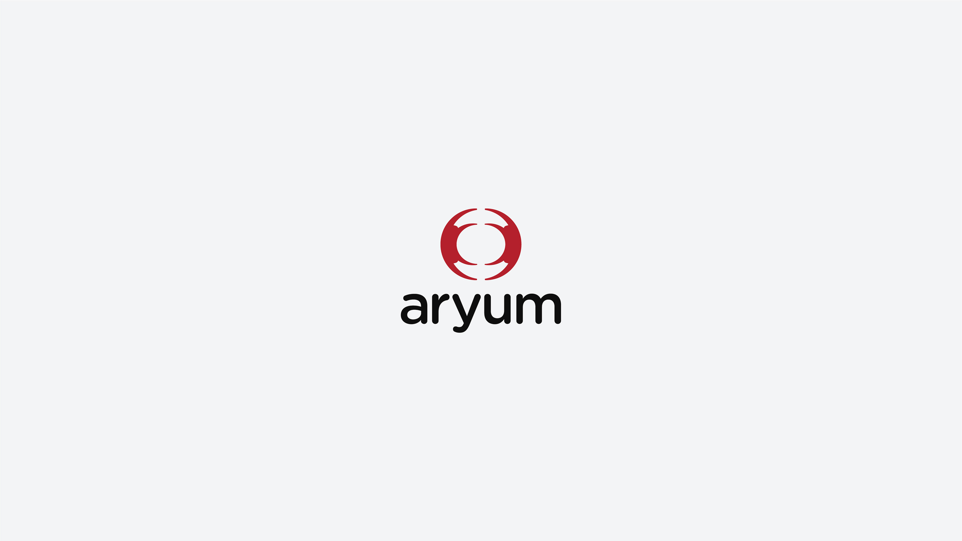
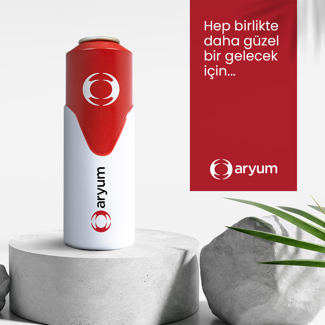
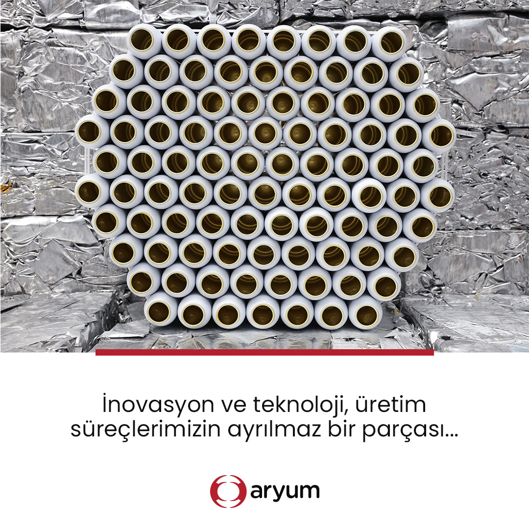
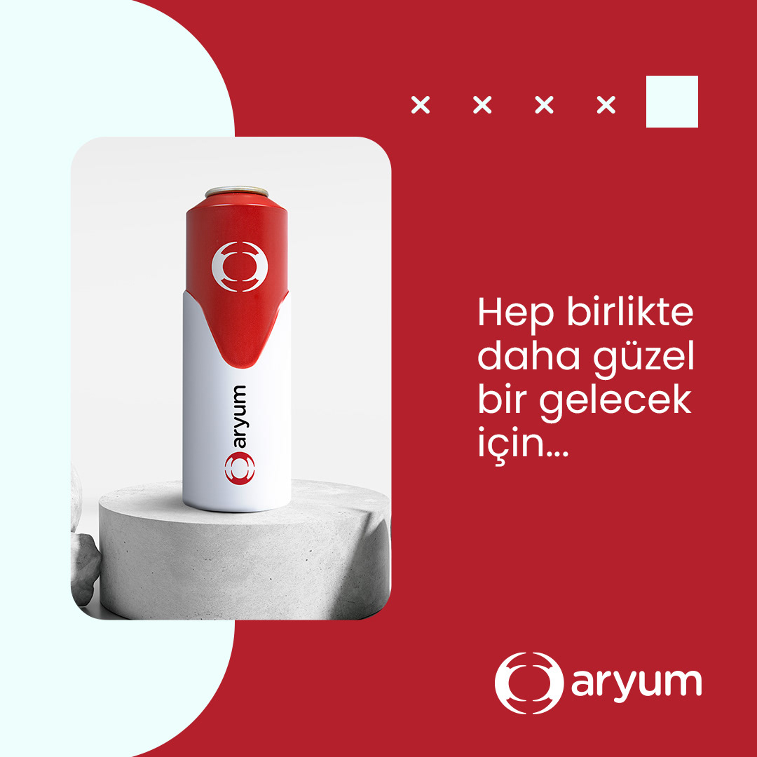
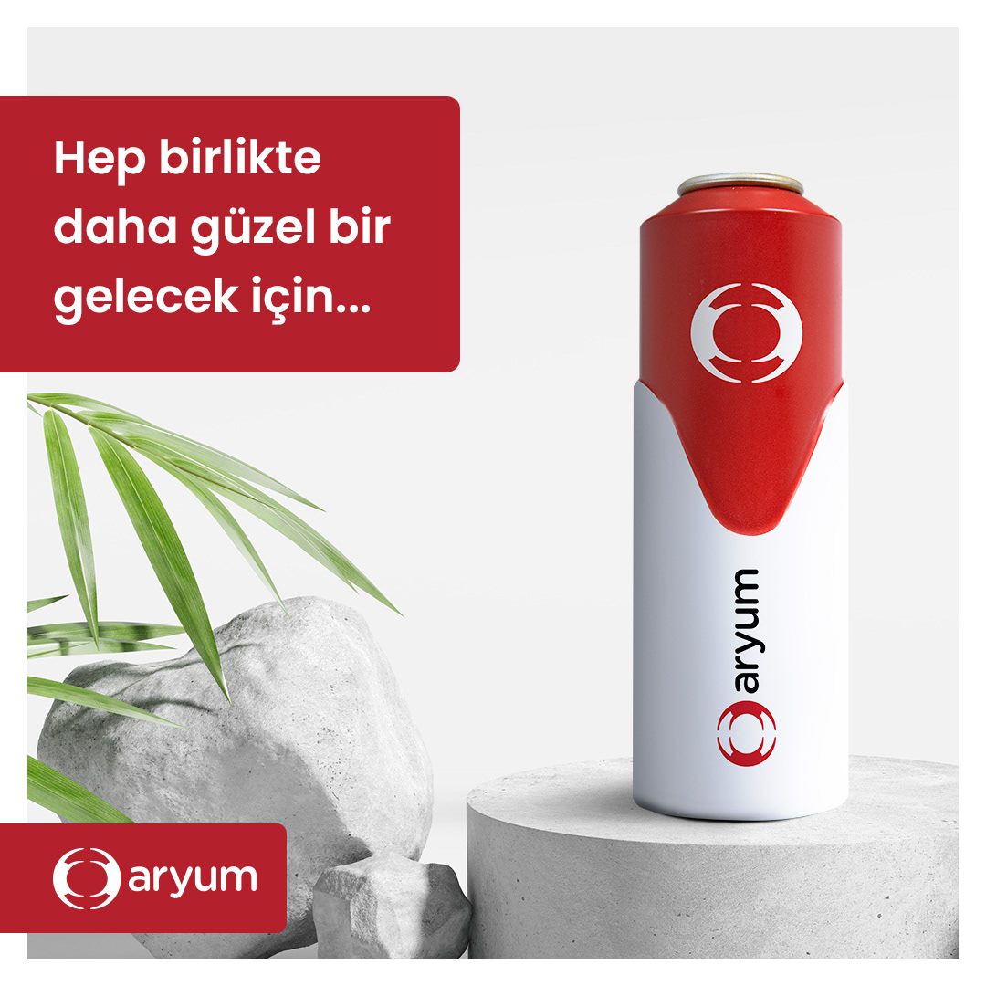
ARYUM LOGO REDESIGN
Aryum Aluminium’s previous logo lacked clarity due to low contrast and limited legibility, which weakened its presence both in digital and print environments. During the redesign process, the icon was simplified and refined into a more balanced form—achieving a modern and impactful look. The typography was updated with a more readable yet distinctive typeface, while the red tone was intensified to better reflect the brand’s energy and visibility. The result is a contemporary, professional, and versatile identity that aligns with Aryum’s innovative position in the aluminium industry.